A human-centered overhaul utilizing a semantic design system,
WCAG accessibility, and Tailwind CSS to elevate usability and performance.
This project involved a full-scale refactoring of a travel brand's digital interface. Moving beyond a visual update, the goal was to architect a scalable, accessible, and intuitive user experience grounded in human-interaction design principles. The solution was a utility-first semantic design system built with Tailwind CSS, ensuring consistency, developer efficiency, and WCAG-compliant accessibility from the outset.
Accessible Component Refactoring
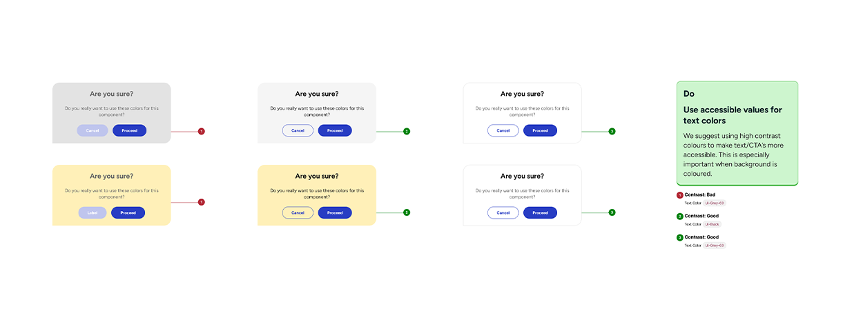
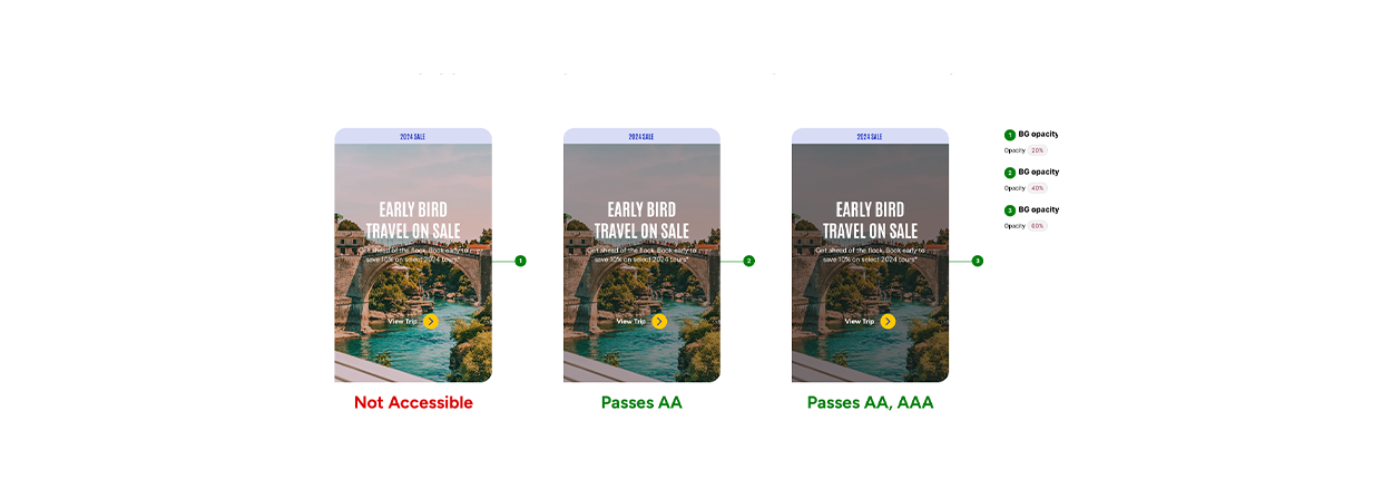
- WCAG-First Component Library: Rebuilt all UI components (buttons, forms, modals, navigation) with accessibility as a core constraint, not an afterthought. This included proper ARIA labels, keyboard navigation sequences, focus traps for modals, and high-contrast states.
- Interaction Design Patterns: Applied methodologies like Fitts's Law for target sizing, Miller's Law for cognitive load management in listings, and consistent feedback principles for all user actions.
- Deliverable: A fully accessible, interactive component library in Figma, mirrored by production-ready code components using the custom Tailwind setup.
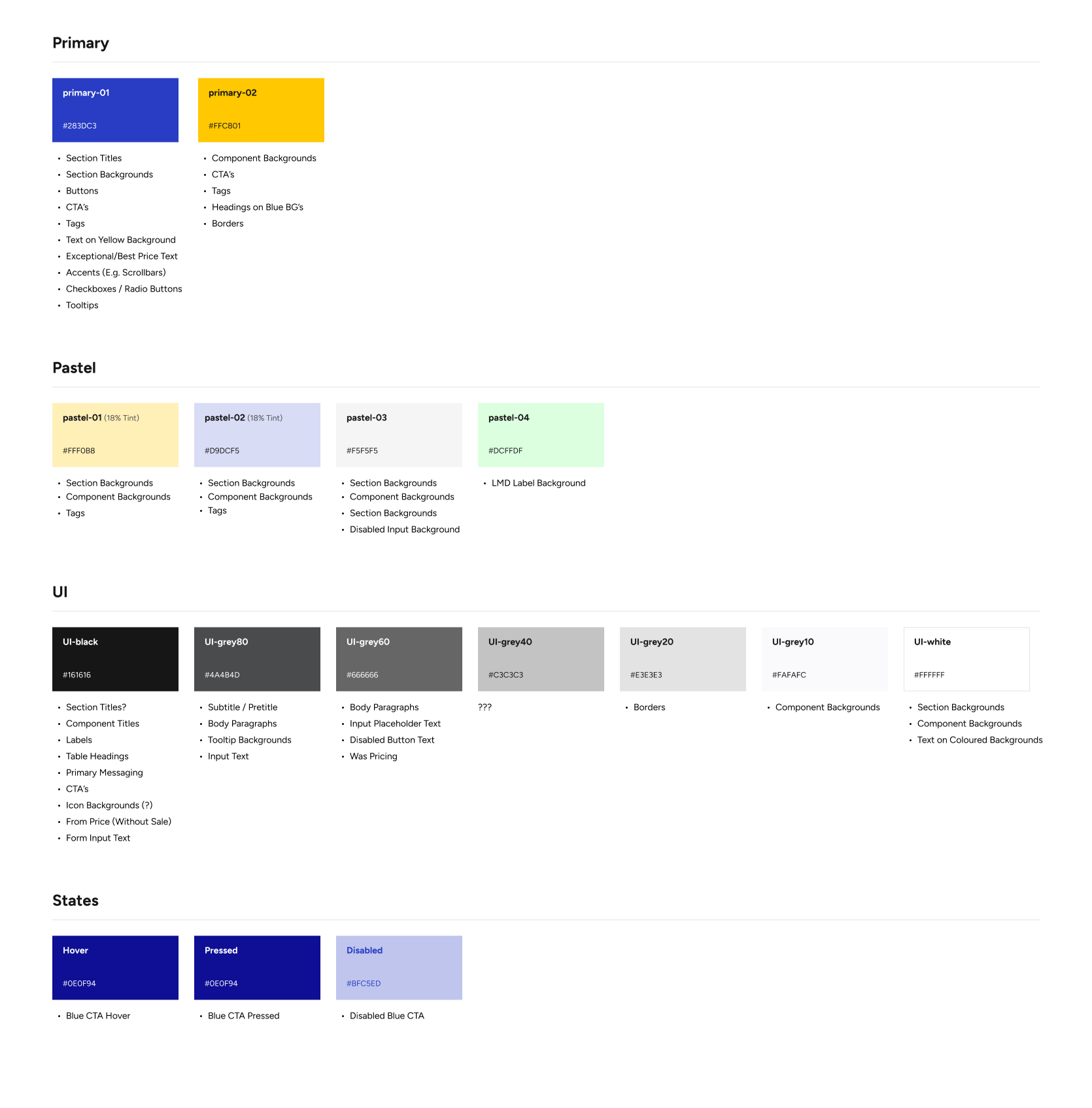
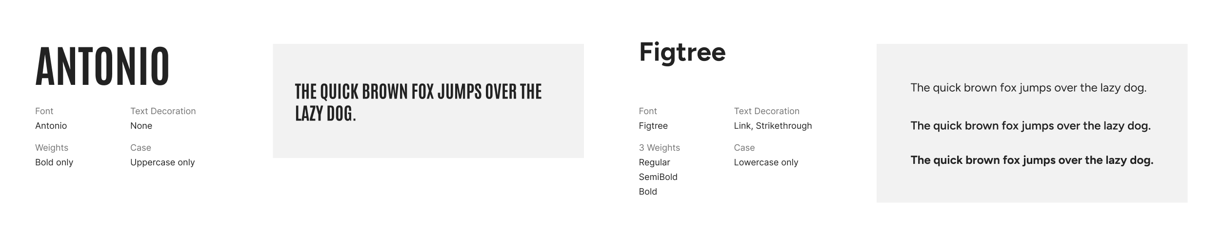
- Tailwind CSS Integration: This token architecture was directly implemented as a custom Tailwind configuration. Semantic tokens became the single source of truth, powering all components and ensuring that a change in the config file propagated universally.
Deliverable: A scalable, maintainable design system core in code, bridging design and development seamlessly.
Visual Transformation: Key Screens
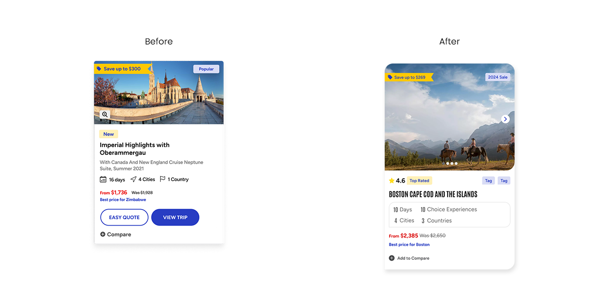
Before
- Inconsistent & Inaccessible UI: The interface suffered from visual inconsistency—buttons, forms, and cards had conflicting styles across pages. Initial WCAG audits showed failures in color contrast, missing focus states, and non-semantic HTML, creating barriers for users.
- Rigid & Hard-to-Maintain Code: The CSS was a monolithic, overridden stylesheet without a clear architecture. Simple style changes risked breaking layouts in unexpected places, slowing down development and increasing technical debt.
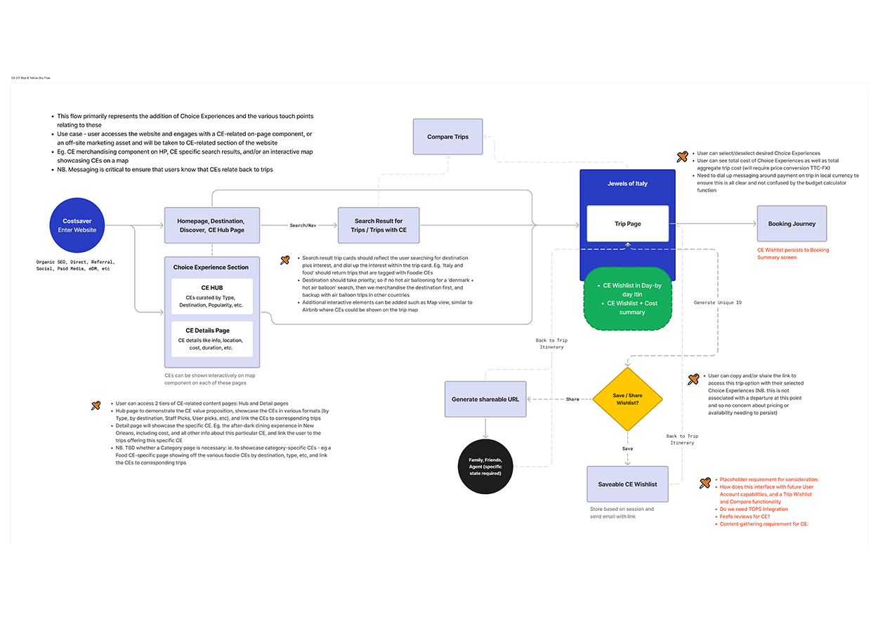
- Confusing User Journeys: Key user flows, like tour booking or information finding, were cluttered with unnecessary steps and unclear information hierarchies, leading to user frustration and task abandonment.
- Disconnected Design-Dev Workflow: Design components in Figma had no direct correlation to the codebase. Handoffs required lengthy documentation, leading to interpretation gaps and style drift in implementation.
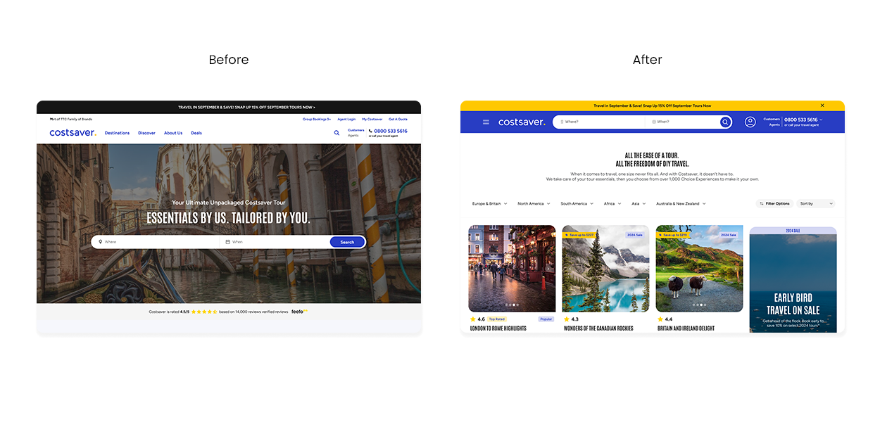
After
- Consistent & WCAG-Compliant Interface: A unified component library, powered by semantic design tokens, now ensures visual and functional consistency. All components are built to meet WCAG 2.1 AA guidelines by default, with proper contrast, keyboard navigation, and ARIA labels.
- Efficient, Utility-First Development: The shift to a Tailwind CSS-driven workflow created a single source of truth. Developers build UIs rapidly using predefined utility classes from our custom configuration, ensuring pixel-perfect alignment with designs and eliminating style bugs.
- Streamlined & Intuitive User Flows: Applying human-interaction principles, we simplified critical journeys. Clear visual hierarchies, predictable components, and actionable feedback reduced cognitive load, guiding users smoothly to their goals.
- Unified Design-Dev Language: The semantic token system acts as a shared language. Tokens like
bg-brand-primaryortext-interactiveare used identically in Figma and the Tailwind config, creating a seamless bridge from design intent to live implementation.
 Final Results
See the principles in action: the screens below show a clearer, consistent, and more accessible interface built with our new design system.
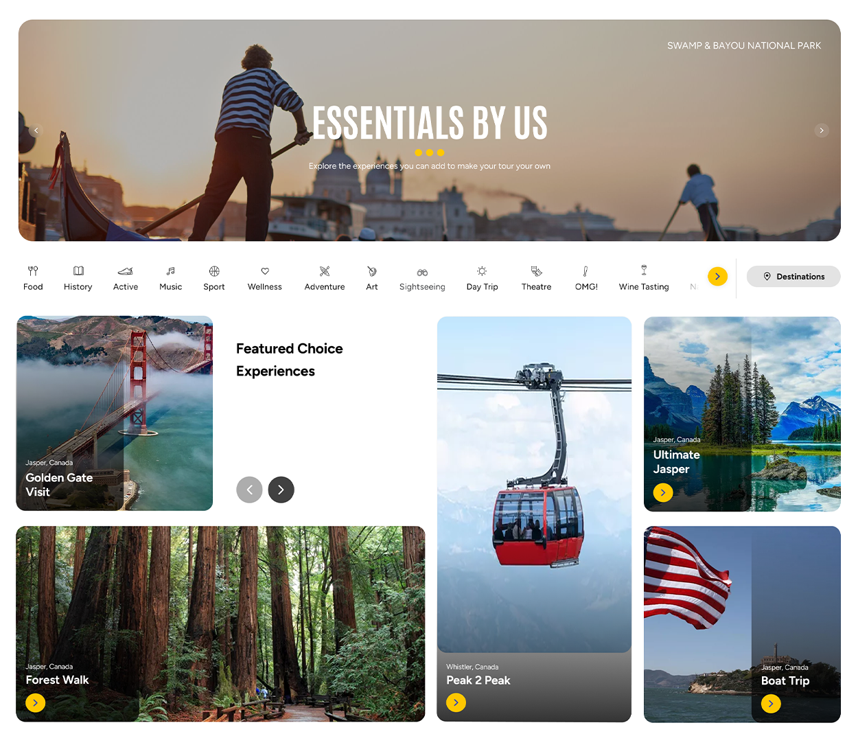
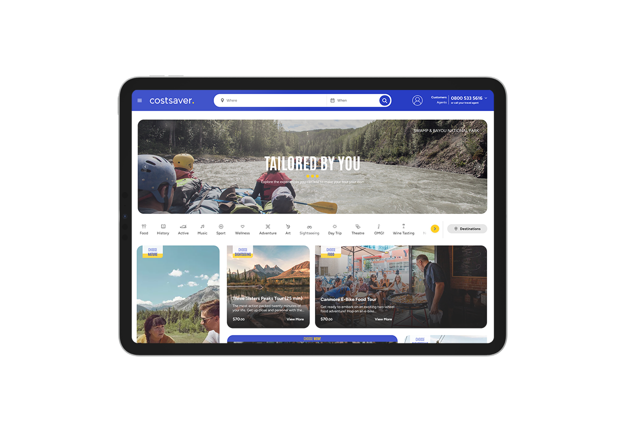
This cohesive implementation elevates user trust, streamlines interaction, and establishes a durable foundation for the brand's digital future.