Semantic Token Design System: A Complete Framework for Multi-Brand Scaling
Core Philosophy: Intent Over Implementation
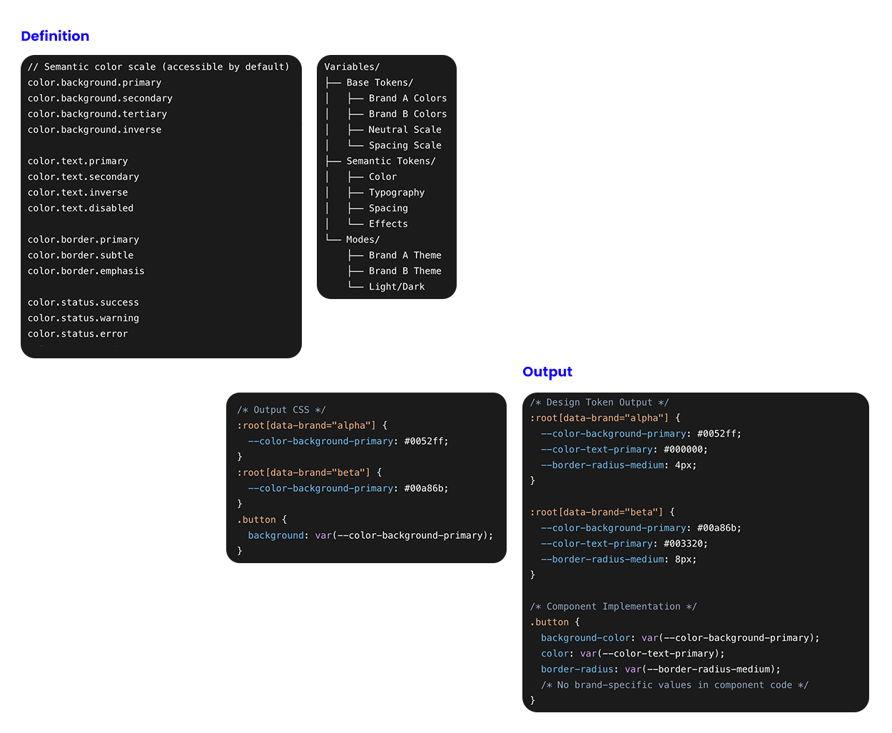
A semantic design system moves beyond hard-coded values to create a language of meaning. Instead of defining
--color-blue-500, we define --color-background-primary. This abstraction separates what something is from what it looks like, enabling true multi-brand flexibility.
My role was to architect and evangelize the core semantic token strategy, translating the principle of "Intent Over Implementation" into a functional, three-layer token architecture. I established the non-negotiable design rules—embedding accessibility logic directly into token relationships and defining perceptual states as first-class system parameters, to ensure every brand expression was inherently accessible. Beyond the framework, I operationalized the system for business impact by defining the implementation workflow, key efficiency metrics, and the agile timeline that enabled multi-brand scaling and secured cross-functional stakeholder adoption.
The Three-Layer Token Architecture
Base Tokens (The Raw Values), Semantic Tokens (The Meaning), Component Tokens (The Application)
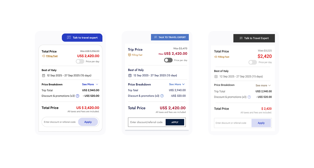
Multi-Brand Mapping Strategy Scenario: Two Brands, One System
Result: The same semantic token (
color.background.primary) renders as blue for Brand A and green for Brand B.Implementation Workflow
Phase 1: Audit & Structure
- Inventory existing brand assets across all brands
- Define semantic categories:
- Color (background, text, border, status)
- Typography (family, size, weight, line-height)
- Spacing (scale, container, section)
- Elevation (shadow layers)
- Border (radius, width)
- Motion (duration, easing)
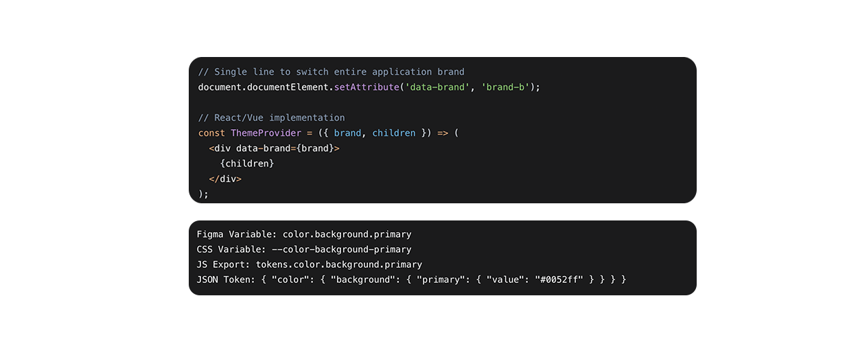
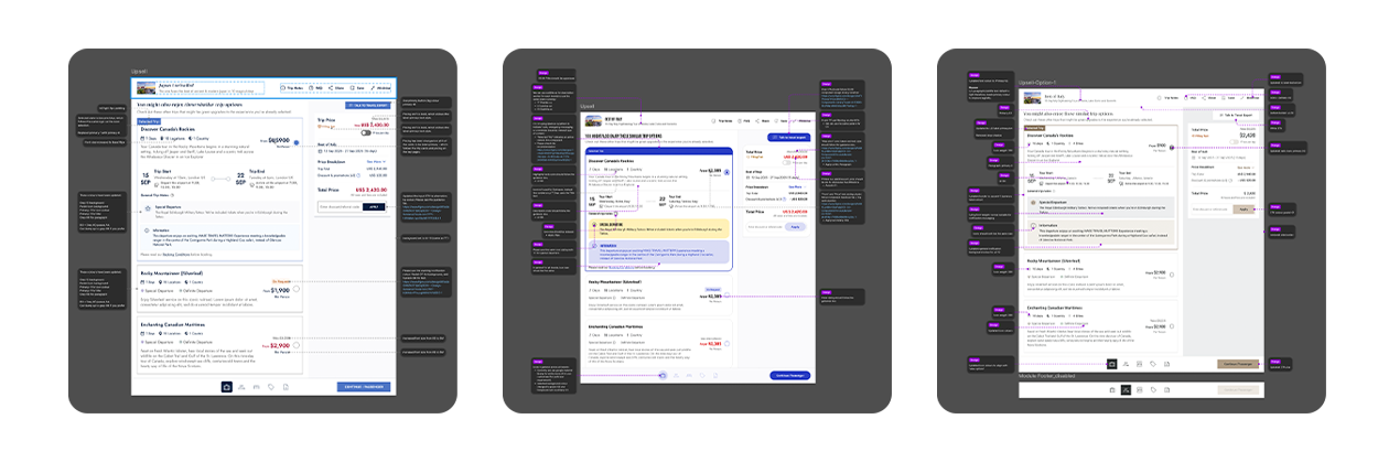
Theme Switching in Production & Design-Development Parity
Components reference only semantic tokens
Changing brand theme swaps all instances instantly
Styles remain consistent regardless of visual appearance
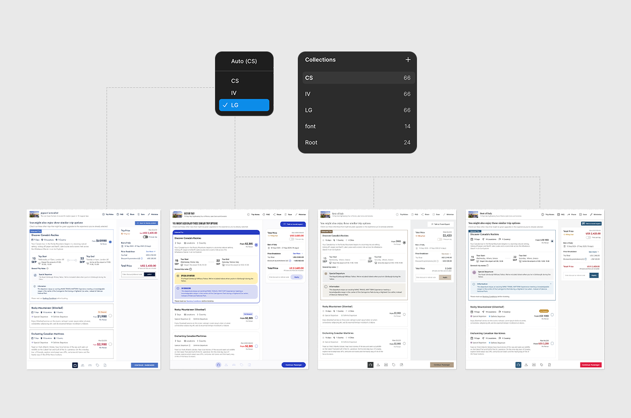
 Automated Documentation:
Token values auto-generate style guides
Component examples show across all brands
Accessibility contrast ratios calculated automatically
Business Impact & Strategic Value: The ROI of Semantic Design Systems
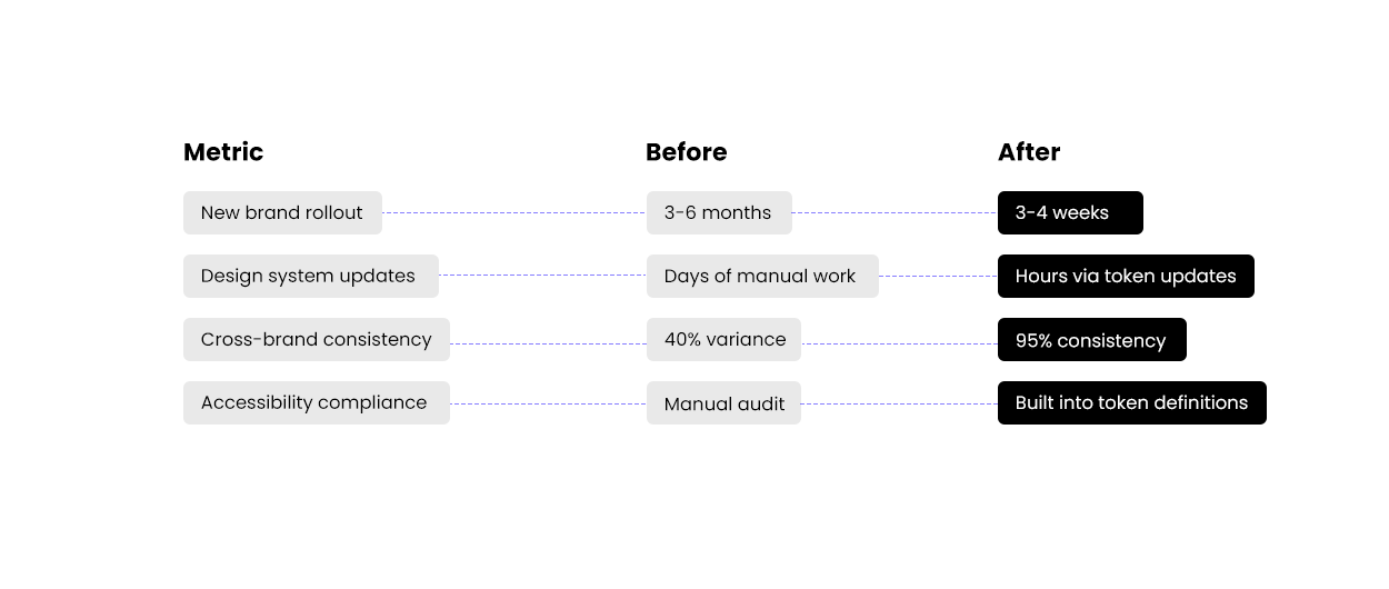 Costsaver Tour In Practice:
 - Defined new brand palette: 3 days
-
Mapped to semantic tokens: 1 day
-
Applied to entire component library: Instant
-
QA and refinement: 2 weeks
- Total: 3 weeks to MVP → Launched 4 months ahead of competitors
Key Metrics to Highlight:
- Development Efficiency: 70% faster brand implementation
- Design Consistency: Single source of truth across all products
- Business Agility: Launch new brand experiences in weeks
- Quality Assurance: Built-in accessibility and design standards
Modularity & Maintainability
Implemented a token hierarchy aligned with atomic design methodology. Base tokens feed into component-specific tokens, facilitating rapid iteration and ensuring design-dev parity. This modular structure supports scalable updates and reduces systemic redundancy.
Accessibility-Driven Logic Embedded WCAG compliance into token relationships
Ensuring contrast ratios, focus states, and interactive feedback are preserved across themes. Tokens are bound to user needs, not just aesthetic outcomes, reinforcing inclusive design practices.
Accessibility is governed by calculated relationships between tokens, not by static values. The semantic token
color.text.primary does not hold a single hex code. Instead, it references a brand-specific color, which is automatically evaluated against its assigned color.background.primary token. The system enforces a minimum contrast ratio (e.g., WCAG AA or AAA) as an immutable rule. 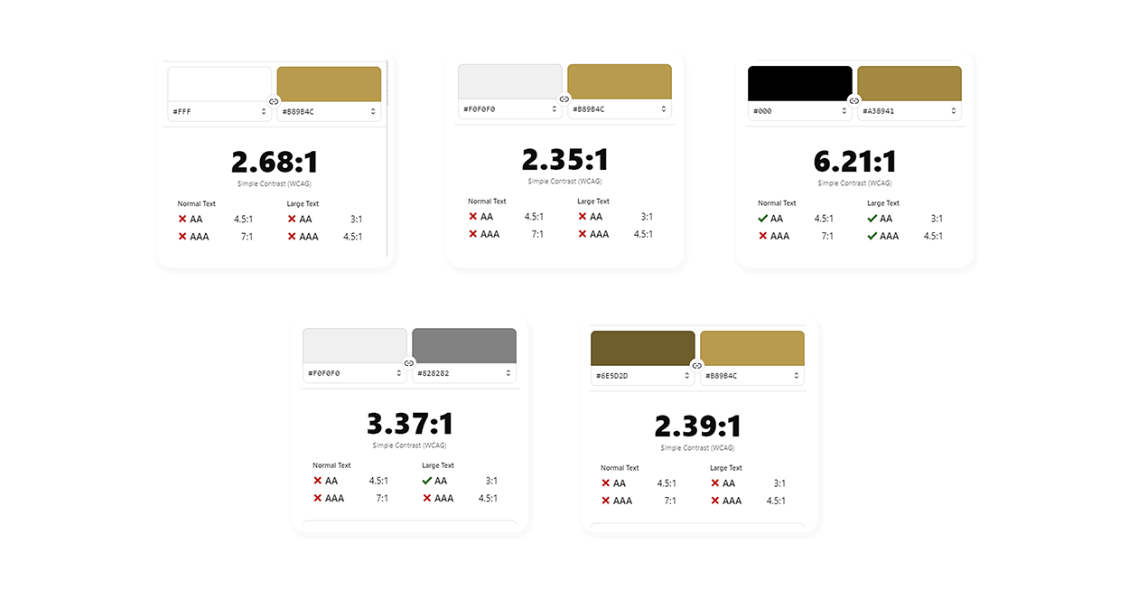 Perceptual States as First-Class Tokens
Interactive states are defined not merely as visual variations, but as critical accessibility feedback. Tokens for
state.focus, state.selected, and state.pressed are required to meet distinct perceptual detachability criteria. This ensures that focus indicators are not just present but meaningfully perceptible, and that state changes are communicated through multiple sensory channels (visual, and programmatically for assistive tech).