Soseu
Food & Beverage
Packaging Design
Branding
Art Direction
www.brkv.co.uk
Food & Beverage
Packaging Design
Branding
Art Direction
www.brkv.co.uk
Korean franchise restaurant.
Soseu is a new and exciting brand for a Korean restaurant, combining traditional culinary techniques with modern sensibility. The name "Soseu" is a nod to the Korean word for "delicious" or "tasty", and reflects our commitment to serving only the best, authentic Korean cuisine to our customers. The brand embodies the warmth, hospitality, and passion for food that are at the heart of Korean culture, and aims to create a welcoming and memorable dining experience for all who visit our restaurant.
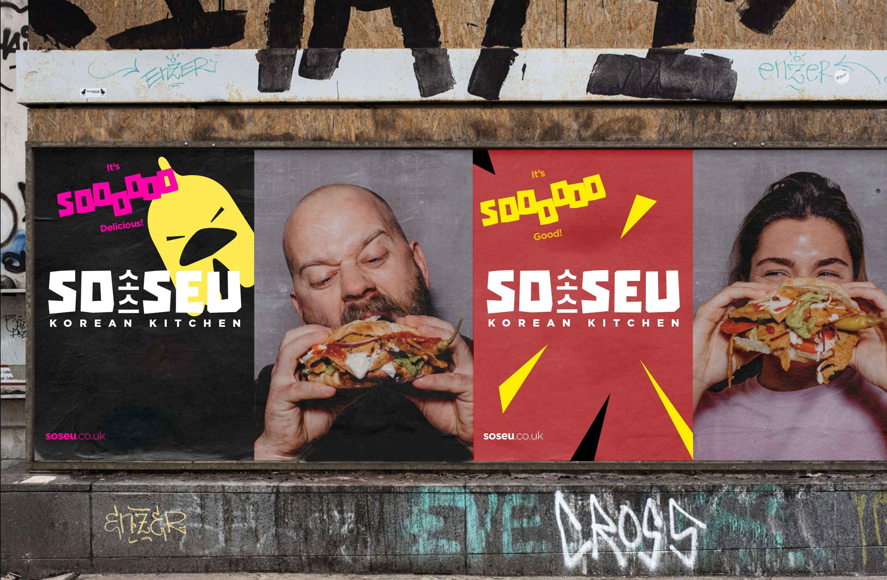
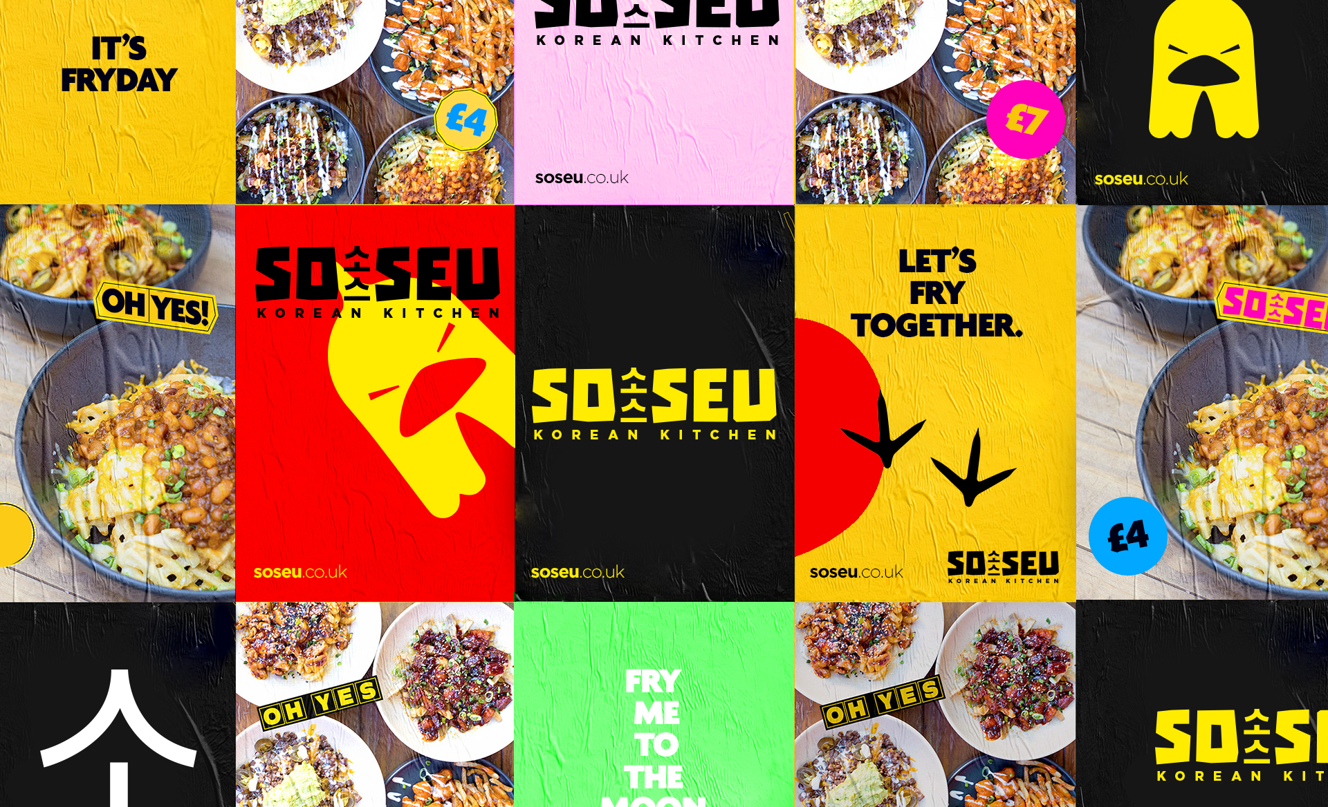
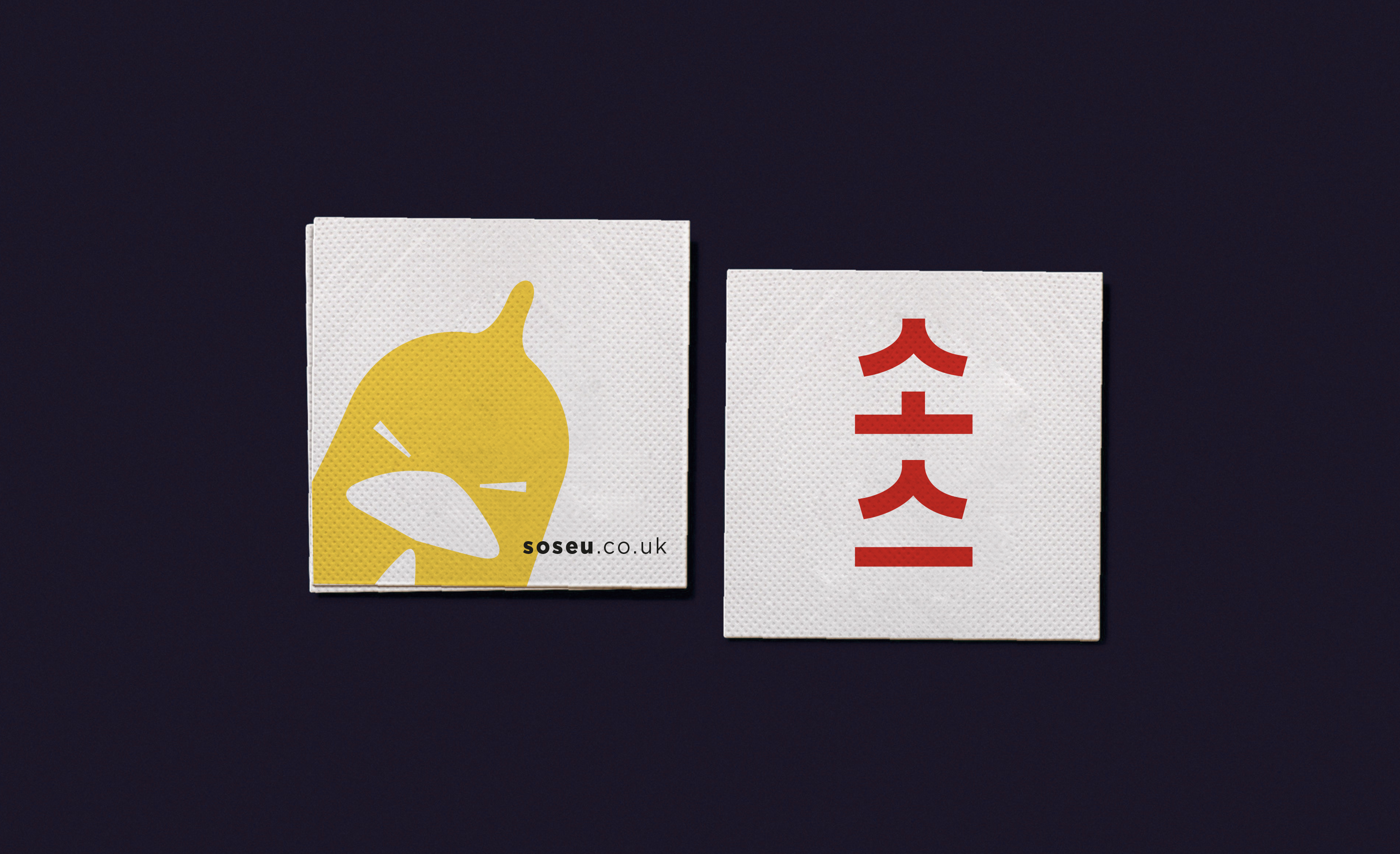
The logo design for Soseu, featuring an angry chicken, is a unique and playful representation of the brand. The image of a chicken, a popular ingredient in Korean cuisine, conveys the authenticity and quality of the food we serve. The "angry" expression adds a touch of humor and personality to the brand, setting it apart from other Korean restaurants and making it memorable to customers.
The use of bold and bright colors in the logo also helps to grab attention and stand out in a crowded marketplace. The image of the angry chicken can be used across all branding materials, from restaurant signage and menu design, to promotional materials and advertising.
Overall, the logo for Soseu successfully captures the spirit of the brand - combining traditional Korean cuisine with a modern, playful twist. It will undoubtedly be a recognizable and memorable icon for customers, and help to establish the brand as a leader in the Korean dining scene in London.
![]()
![]()
![]()
![]()
![]()
![]()
![]()
Soseu is a new and exciting brand for a Korean restaurant, combining traditional culinary techniques with modern sensibility. The name "Soseu" is a nod to the Korean word for "delicious" or "tasty", and reflects our commitment to serving only the best, authentic Korean cuisine to our customers. The brand embodies the warmth, hospitality, and passion for food that are at the heart of Korean culture, and aims to create a welcoming and memorable dining experience for all who visit our restaurant.
The logo design for Soseu, featuring an angry chicken, is a unique and playful representation of the brand. The image of a chicken, a popular ingredient in Korean cuisine, conveys the authenticity and quality of the food we serve. The "angry" expression adds a touch of humor and personality to the brand, setting it apart from other Korean restaurants and making it memorable to customers.
The use of bold and bright colors in the logo also helps to grab attention and stand out in a crowded marketplace. The image of the angry chicken can be used across all branding materials, from restaurant signage and menu design, to promotional materials and advertising.
Overall, the logo for Soseu successfully captures the spirit of the brand - combining traditional Korean cuisine with a modern, playful twist. It will undoubtedly be a recognizable and memorable icon for customers, and help to establish the brand as a leader in the Korean dining scene in London.