Overview
Have you ever noticed how transparent surfaces and translucent materials can make our visual experience feel more simplified and clear? That's exactly what inspired me to design my website, Ava, with a focus on simplicity and transparency.
Removing unnecessary clutter and providing clear communication, my goal is to provide my visitors with a seamless and enjoyable user experience. I believe that by drawing inspiration from these materials, I can create a website that not only looks beautiful but also functions efficiently, ultimately benefiting my audience.
Problem
I struggled with addressing common pain points such as overwhelming and cluttered design, confusing messaging, lack of trust, and poor user experience, but by drawing inspiration from transparent surfaces and translucent materials, I was able to create a design that simplified the user experience and addressed these pain points.
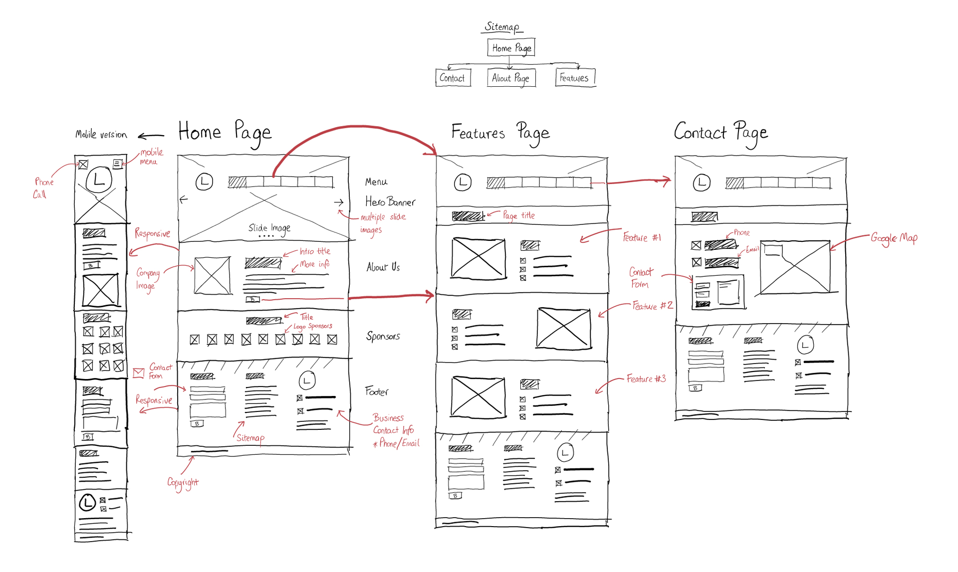
System Architecture & Function
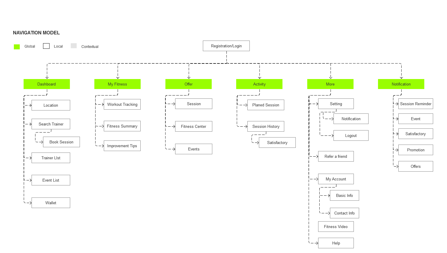
Typography, Colors

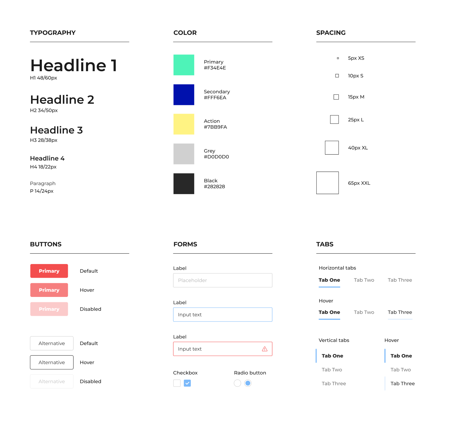
Wireframes
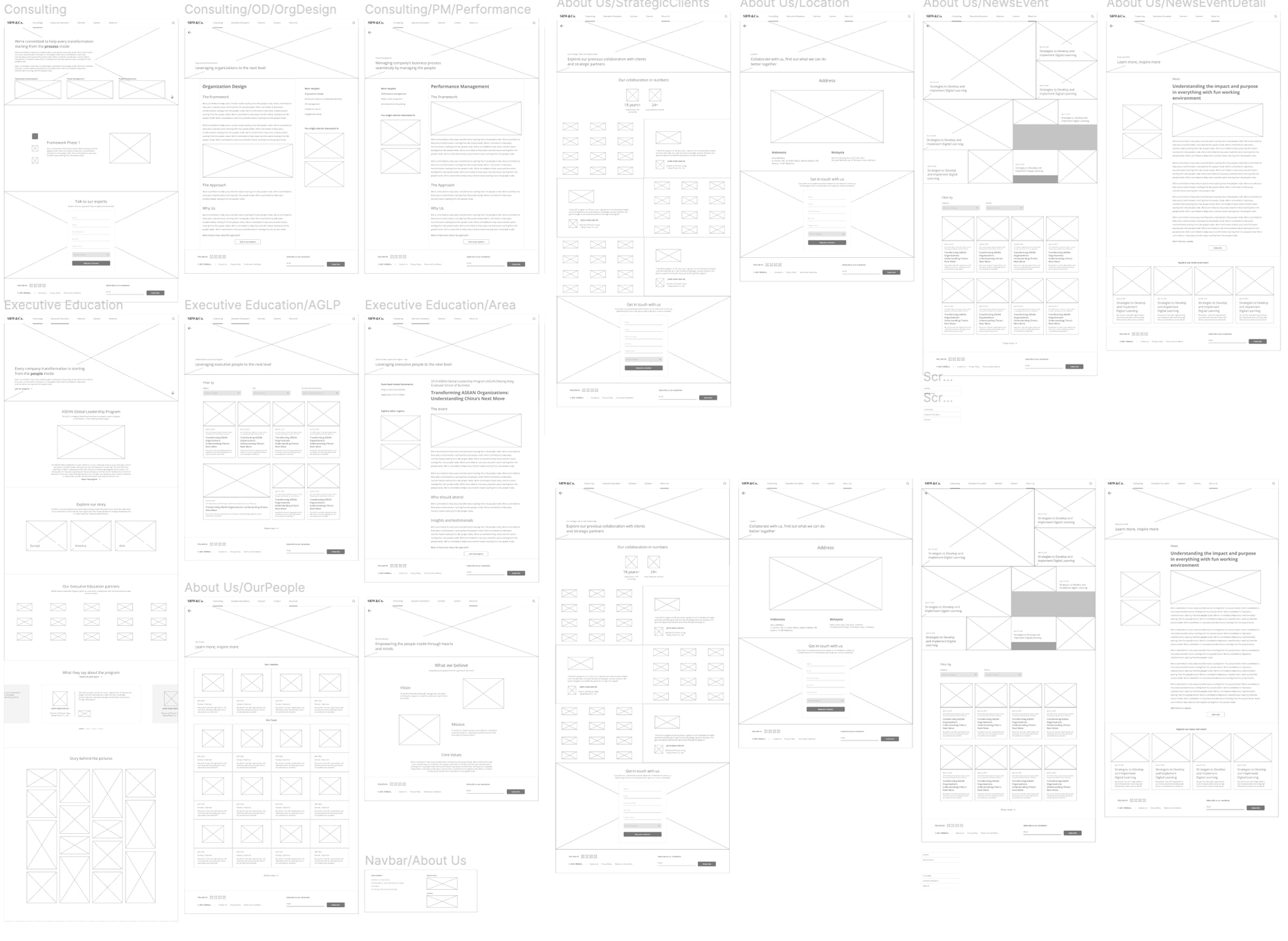
Next comes the mockup — the interface. Mockups should be visual. This is the documentation where the user solidify our visual decisions, experiments with alternatives, optionally build up pixel-perfect crafts

The Interface
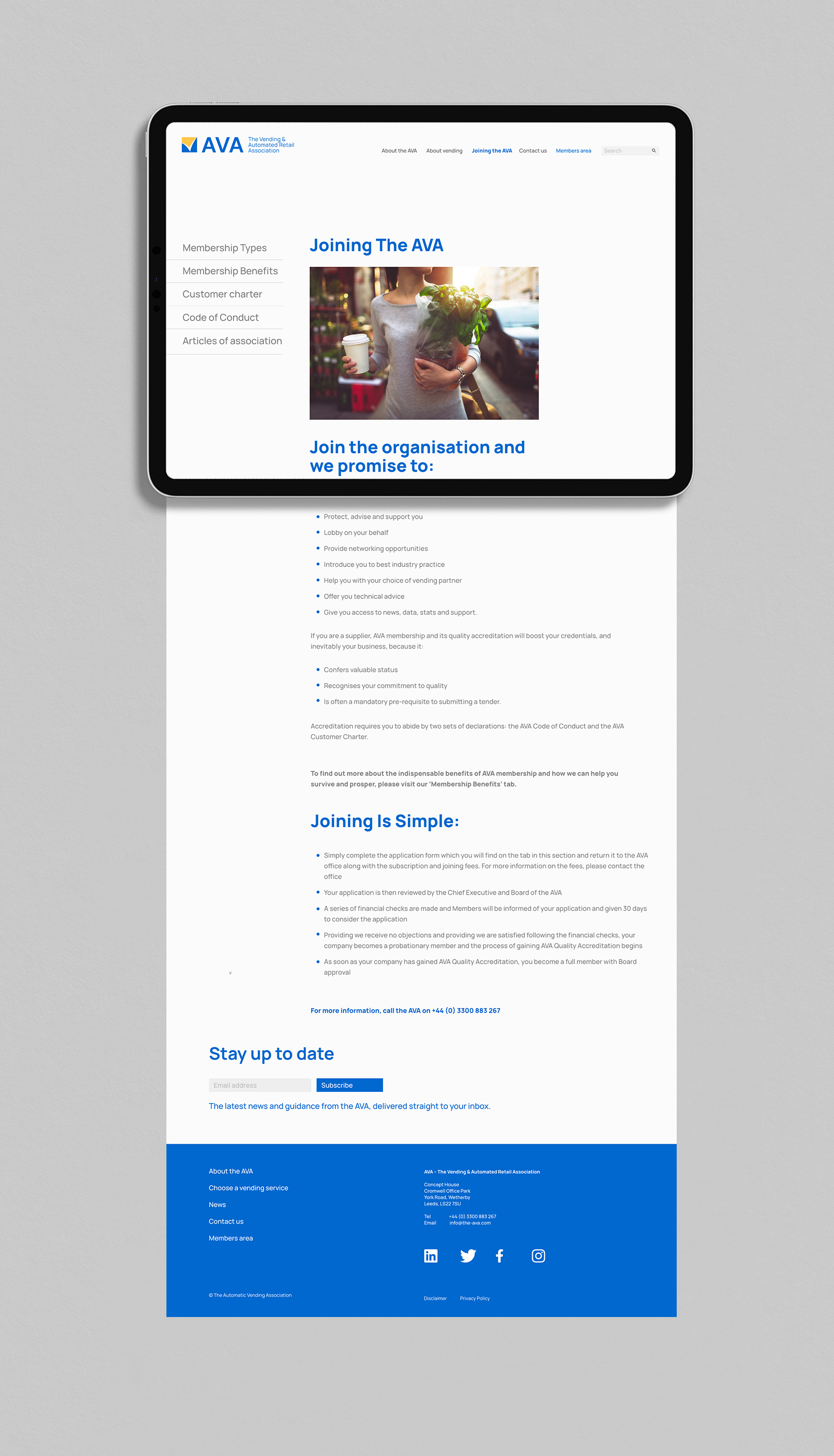
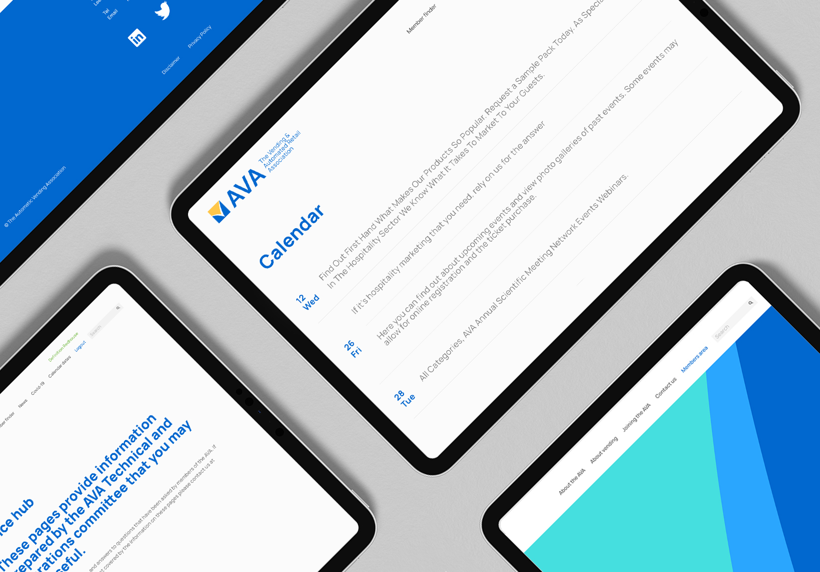
The user interface design of Ava is focused on providing a simple and intuitive experience for its users. By using a minimalist design approach with a clean layout and a neutral color palette, the interface is able to reduce visual clutter and draw attention to the most important information. The design is also human-centered, prioritizing the needs and goals of the user in order to create a seamless and enjoyable experience.
For example, the navigation menu is prominently displayed at the top of the page, making it easy for users to quickly find what they're looking for. The font and typography are also carefully chosen to ensure legibility and readability, with a focus on clarity and simplicity.
Another aspect of the human-centered design of Ava is its use of transparency and open communication. By providing clear and concise messaging, users are able to understand what the website is about and what actions they can take. This approach also fosters trust and credibility, which can lead to stronger relationships between the website and its users.
Overall, the user interface design of Ava is simple, elegant, and human-centered, focusing on the needs and goals of its users to create a seamless and enjoyable experience.
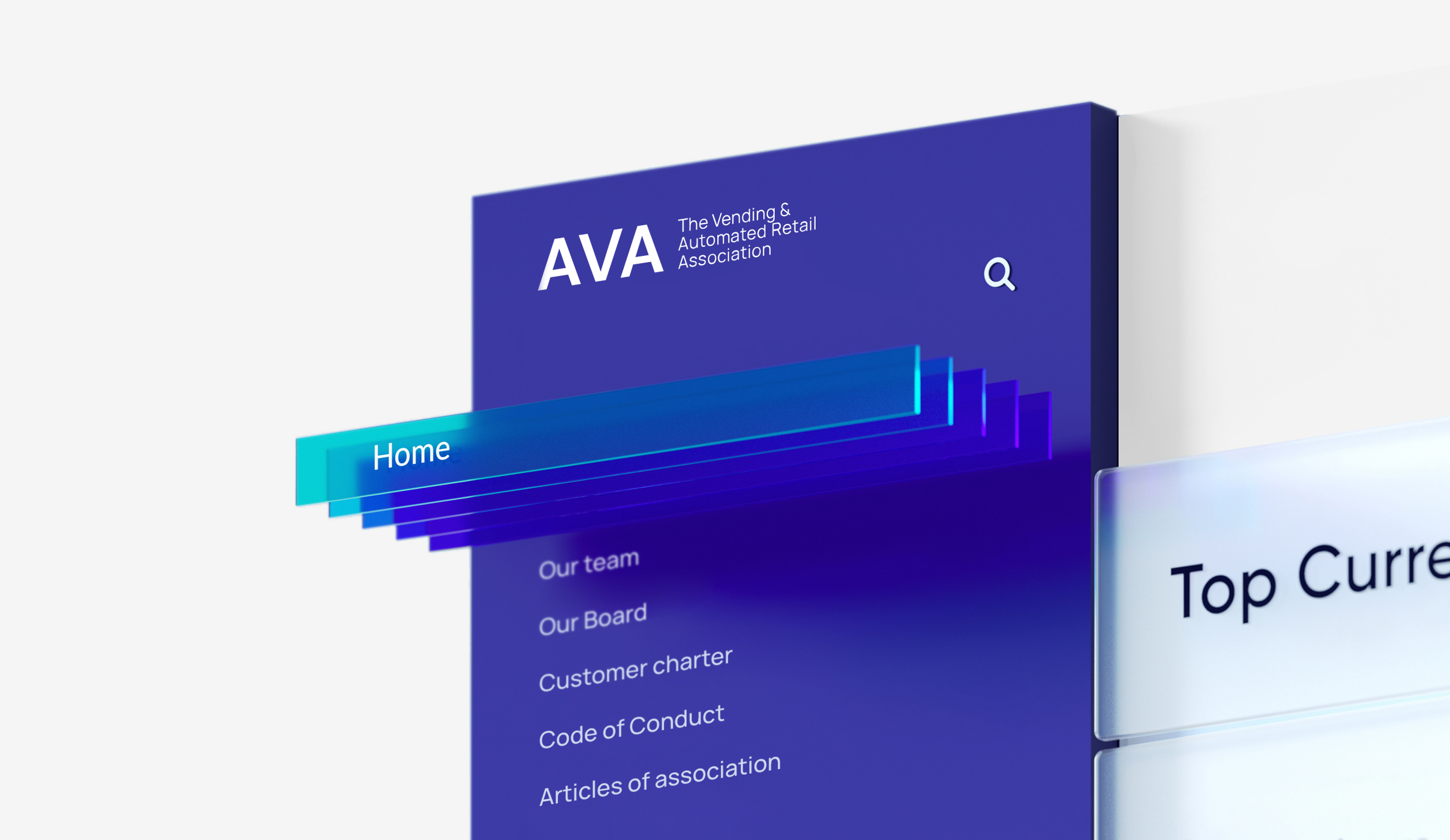
Onboarding / Landing Page
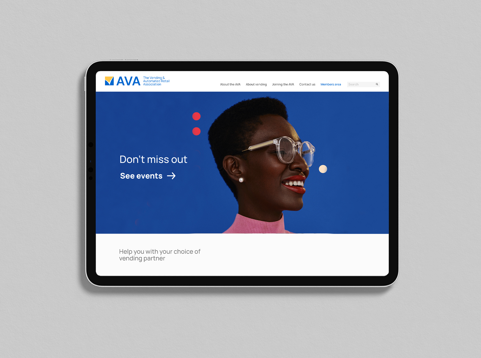
The onboarding process of Ava is designed to be user-friendly and efficient, guiding new users through the registration process and introducing them to the key features and functionalities of the website.
Process starts with a clear and concise welcome message that outlines the benefits of signing up for the website. This message is accompanied via a prominent call-to-action button that invites users to create an account.
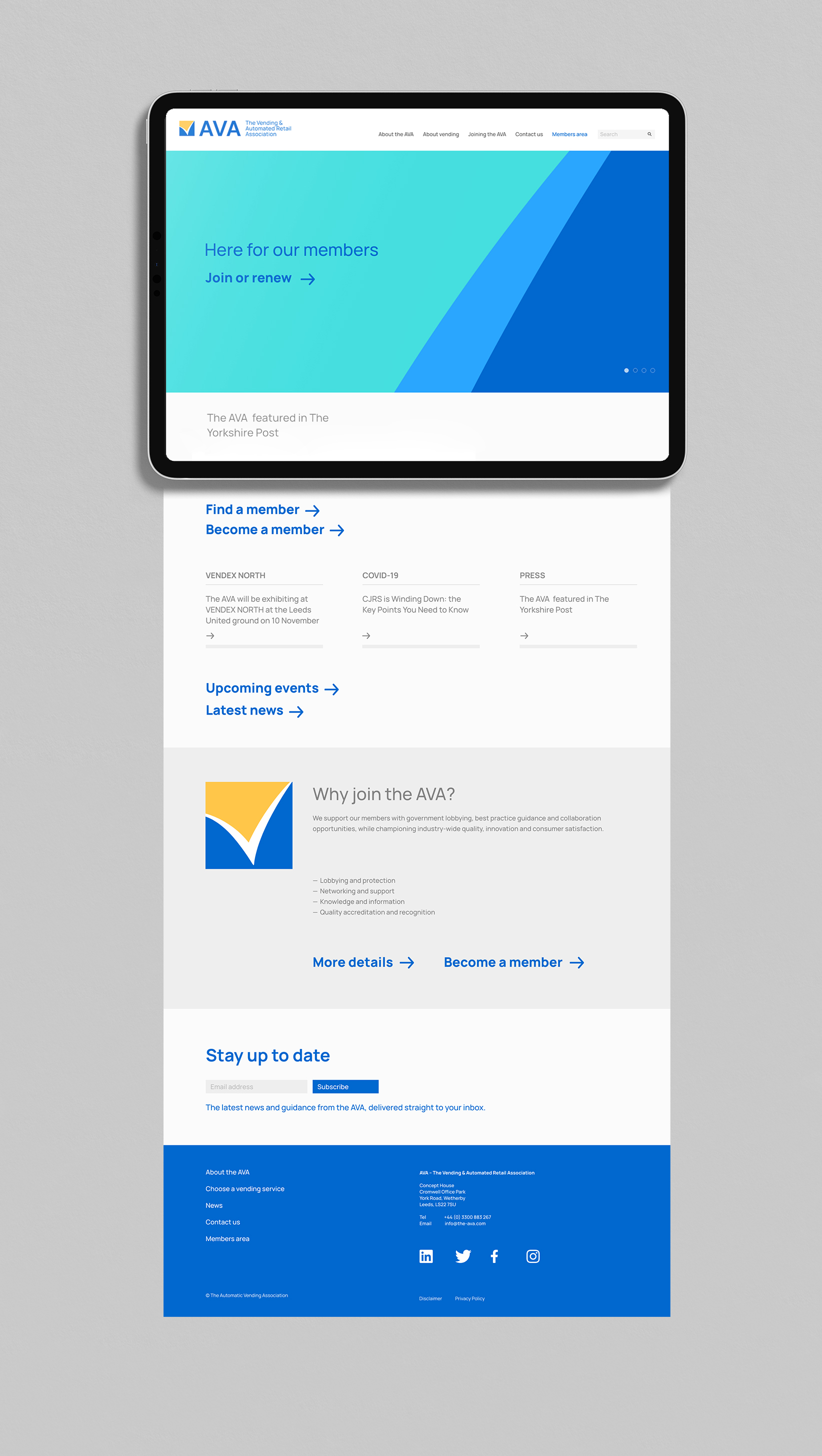
infographics, Insights
This feature can help to create a sense of community and foster connections between members who may not have otherwise known about each other.
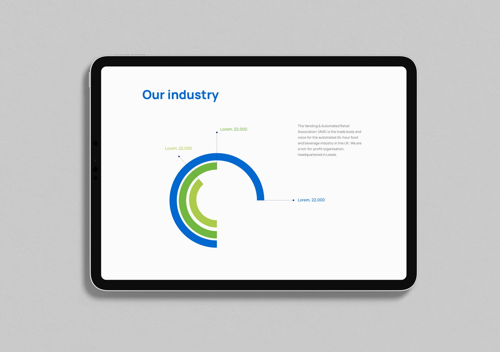
Member Map
The member map on our website, Ava, allows visitors to see the location of other members within a certain community or organization. By displaying this information visually on a map, visitors can easily identify other members who may be nearby or located in a specific region.

Result
As a UI/UX designer, my approach is to prioritize simplicity, clarity, and transparency in order to create user-friendly designs.
Drawing inspiration from transparent surfaces and translucent materials, I have been able to bring an added value to my designs, creating visually appealing interfaces that are easy to navigate and communicate effectively with the user.